A new institution, credible from its first meeting.
The identity on the documents an institution issues.
How the system carries from the mark onto a prospectus, a certificate and a trainee card.
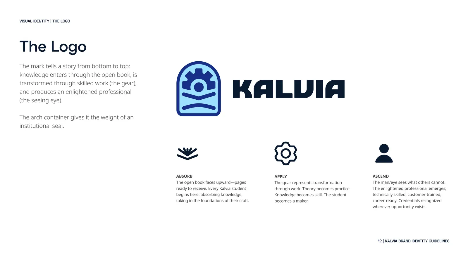
Read it from the bottom up.
Three parts inside an arch, the shape of an institution’s seal.
- AscendThe figure: the professional it makes.
- ApplyThe gear: the skill, put to work.
- AbsorbThe open book: what a trainee takes in.
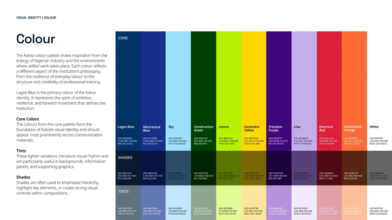
One blue for the institution. A colour for every trade.
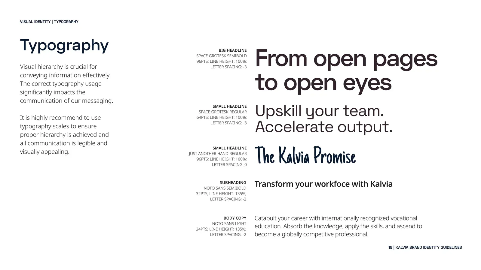
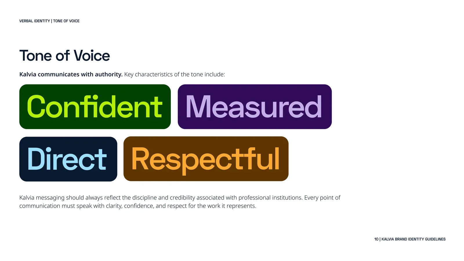
Engineered headlines, plain-spoken text, one human hand.
Professional, not apprentice.
Africa’s next class of technical professionals starts here. Building the future of Africa’s skilled workforce.
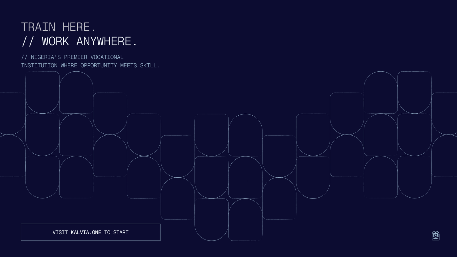
Train here. Work anywhere.
- Space Grotesk
- Headlines, SemiBold, −3% tracking
- Noto Sans
- Text, Light and SemiBold
- Just Another Hand
- Accent, used sparingly
A new institution has no track record to trade on, so the identity had to do the work: signal rigour and permanence from day one, in a category where most brands look informal and trade training still carries a stigma.
What we chose, and why.
Give a trade school a seal.
The arch borrows the geometry of a university or licensing seal. Inside it the mark reads bottom to top: absorb, apply, ascend.
Code the palette to the trades.
Lagos Blue anchors the identity and each discipline gets its own colour, so a new programme means picking a colour, not reopening the brand.
Hold up from a signboard to an app screen.
An institutional type system with a handwritten accent, used sparingly, so the school never sounds like a licensing authority.
An identity built to look established from day one.
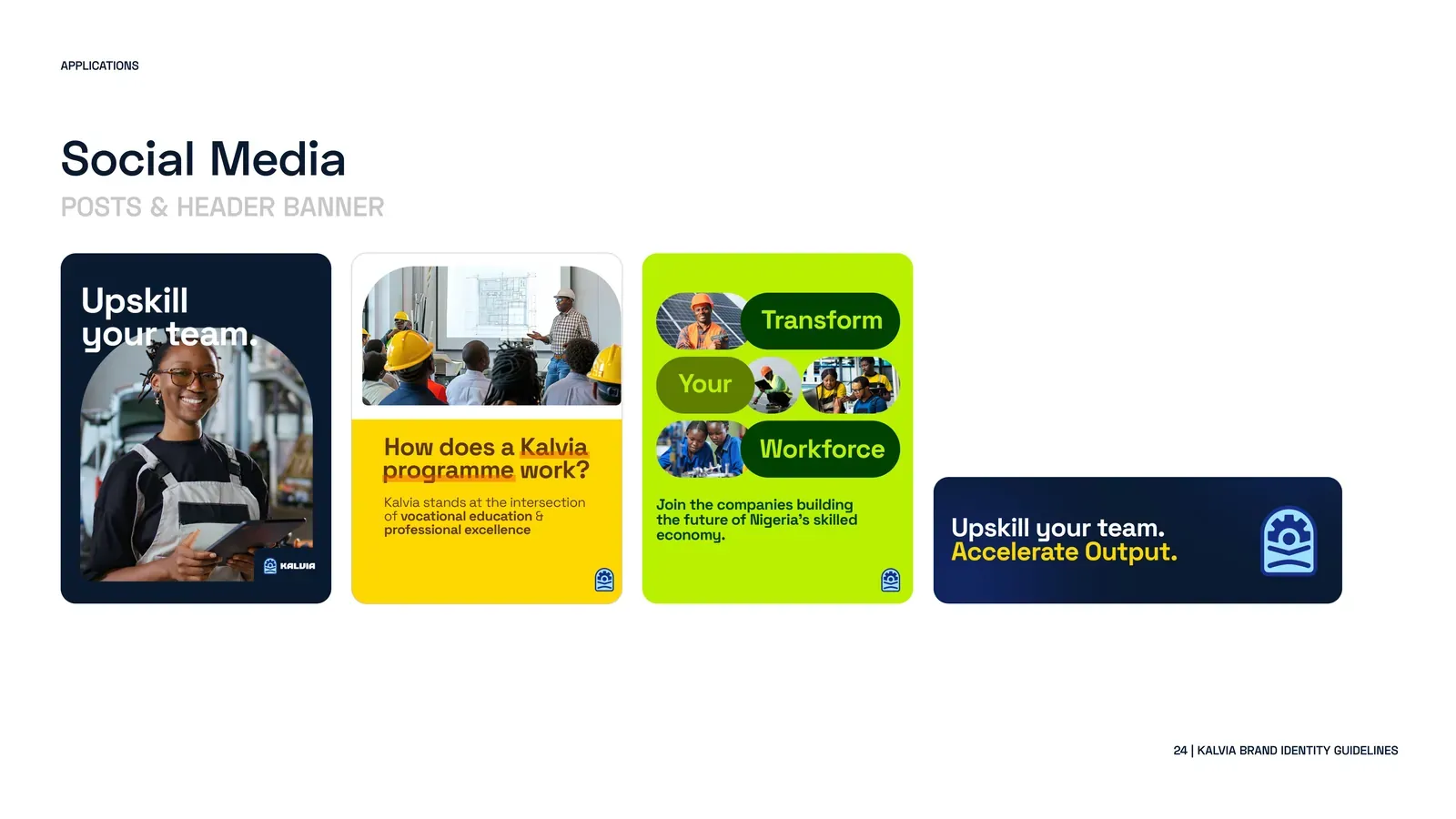
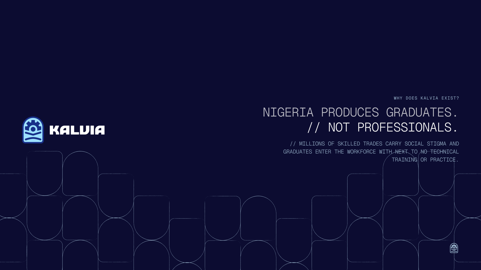
Where people met it first.
Scroll sideways.
What followed
The same people, from the first call to launch.