Build the symbol from the ingredients.
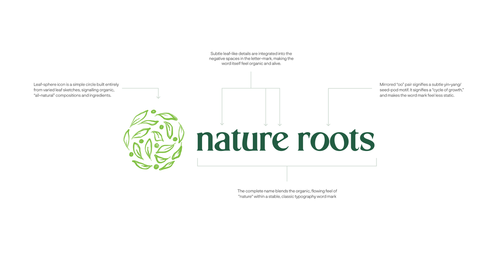
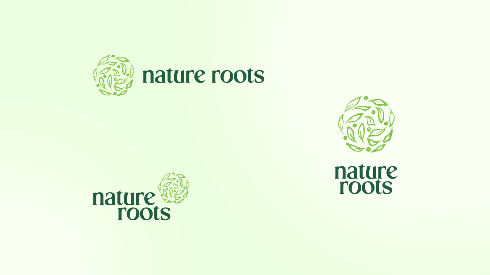
The leaf-sphere is assembled from varied botanical sketches. Together, they form a compact emblem that suggests natural composition and works independently of the wordmark.
A natural-products brand bringing African ingredients into food, skincare and everyday wellness.
One identity for a world of African ingredients.
How do you give coffee, shea butter and botanical powders one recognisable brand without making them look like the same product? Nature Roots needed an identity flexible enough to express the provenance of each ingredient, while feeling clear and contemporary across a varied product range.
We built the visual system around a botanical sphere made from individual leaf forms and a serif wordmark with subtle organic details. Deep greens, warm neutrals and a mix of expressive and functional typography create consistency without sameness. Flexible lockups, packaging concepts and editorial messaging let the identity move across products and communications.
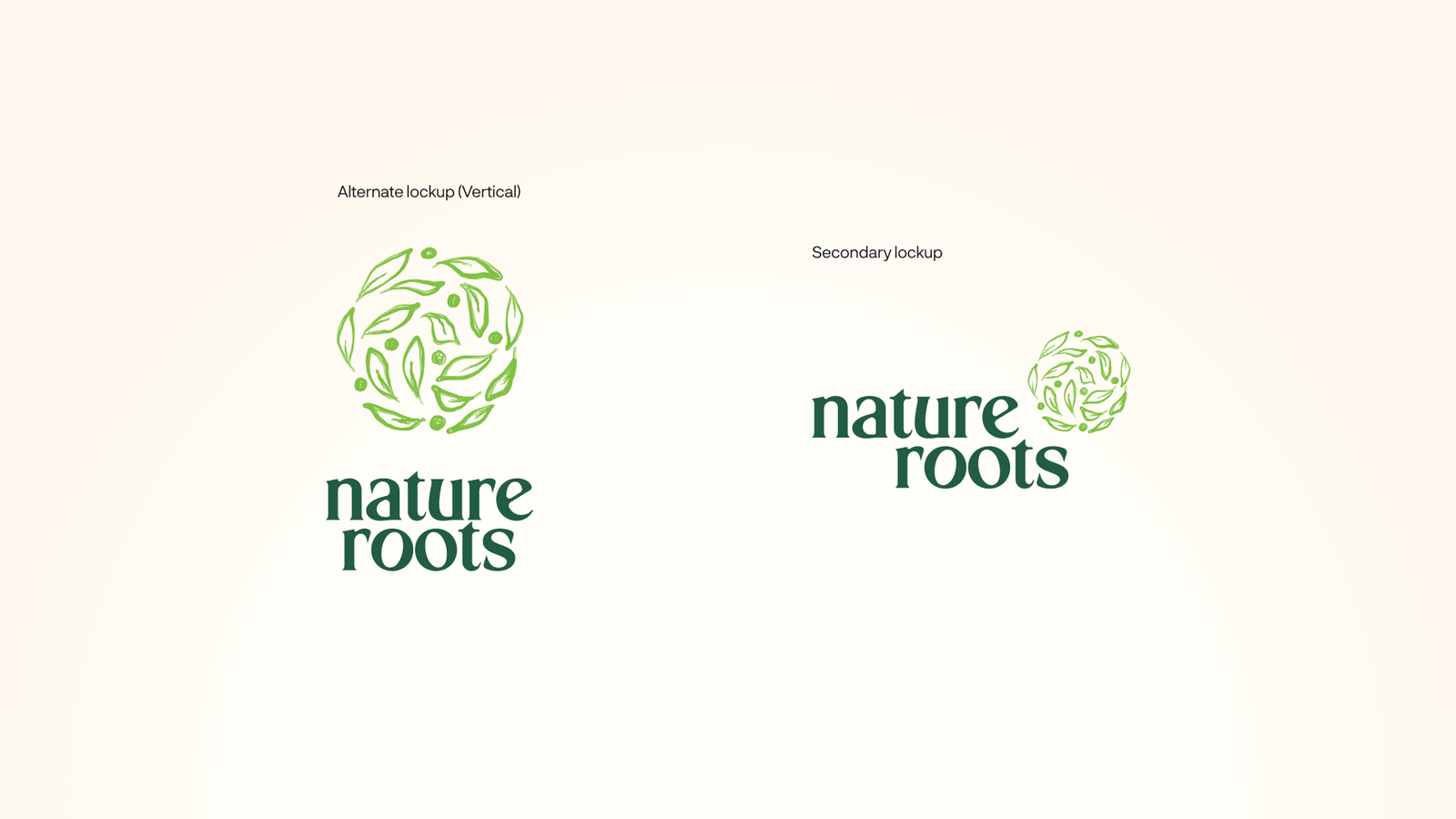
A leaf-built emblem and a wordmark designed to feel organic without becoming ornamental.
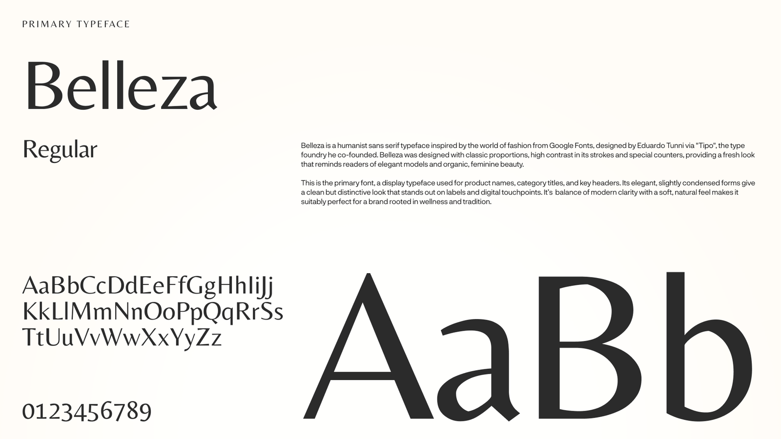
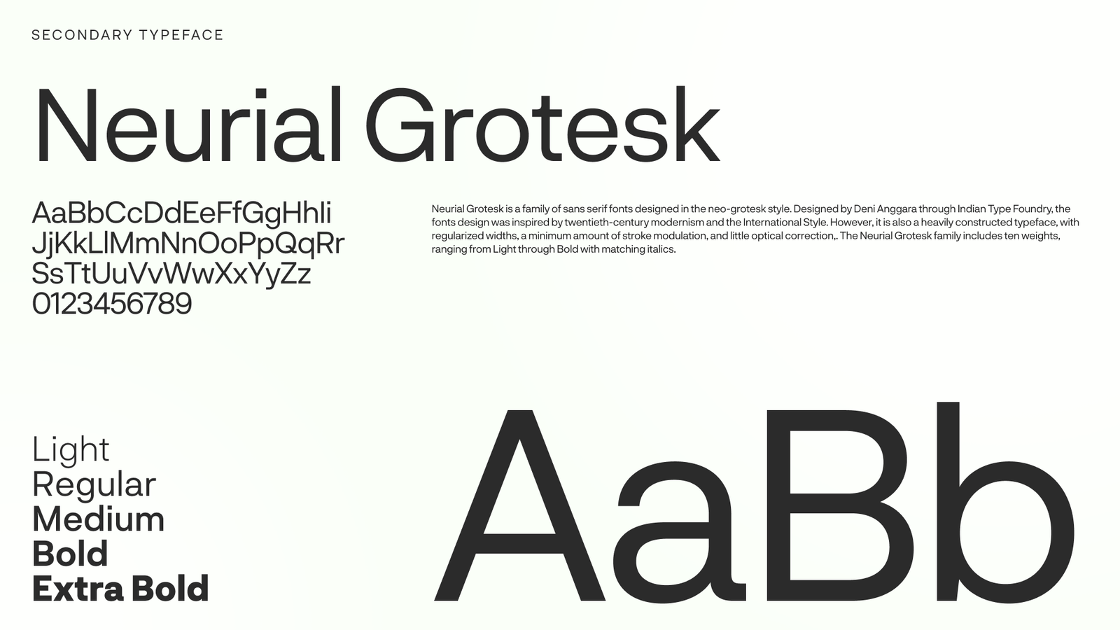
Editorial warmth for headlines; functional precision wherever the customer needs detail.
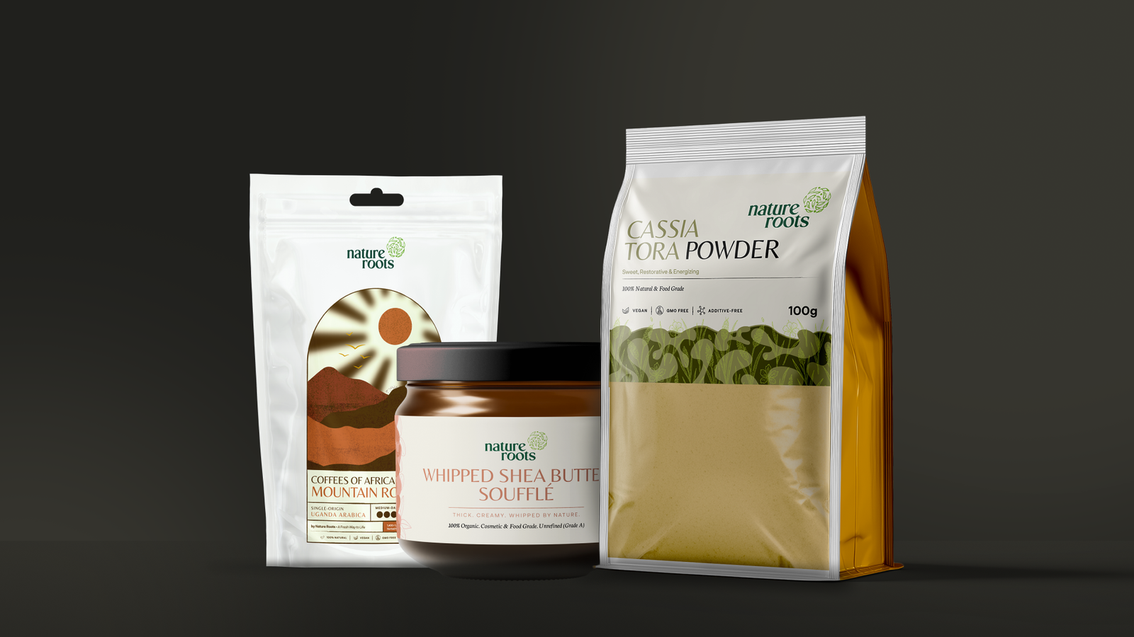
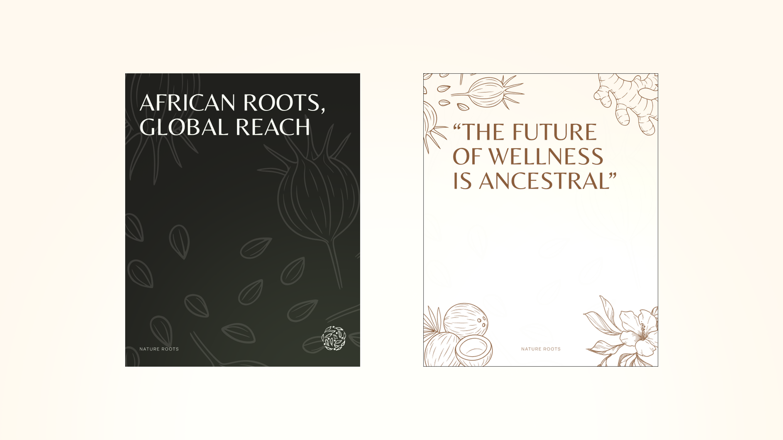
An identity with room for different ingredients, formats and messages.
A natural-products brand bringing African ingredients into food, skincare and everyday wellness.
The leaf-sphere is assembled from varied botanical sketches. Together, they form a compact emblem that suggests natural composition and works independently of the wordmark.
Leaf-like details in the letterforms and the mirrored ‘oo’ introduce movement and growth without losing the stability of a classic serif signature.
Belleza gives the identity an expressive editorial voice; Neue Grotesk handles functional information, from pack details to digital communications.
The same identity moves from shea butter to botanical powder and coffee while allowing different ingredients, colours and illustrations to lead each pack.
Ready when you are.